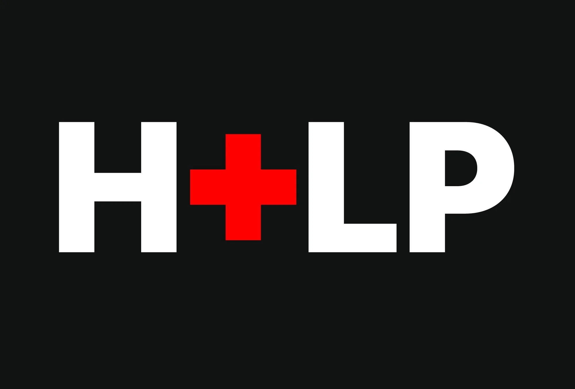
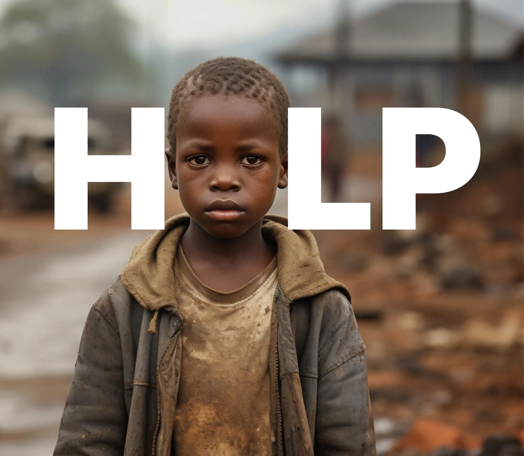
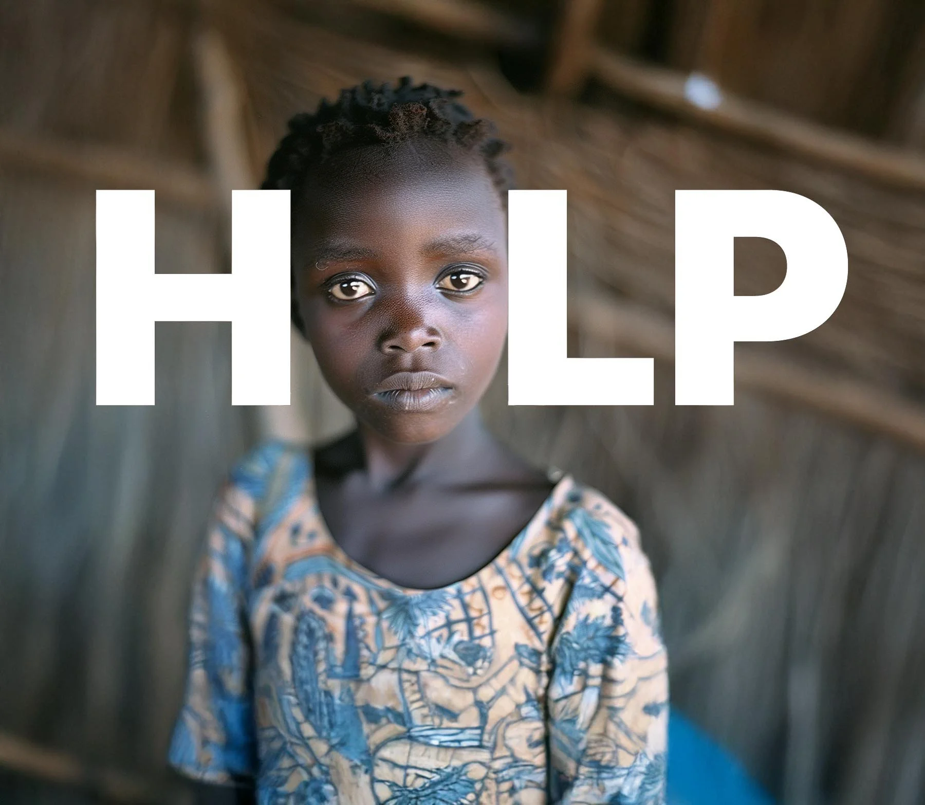
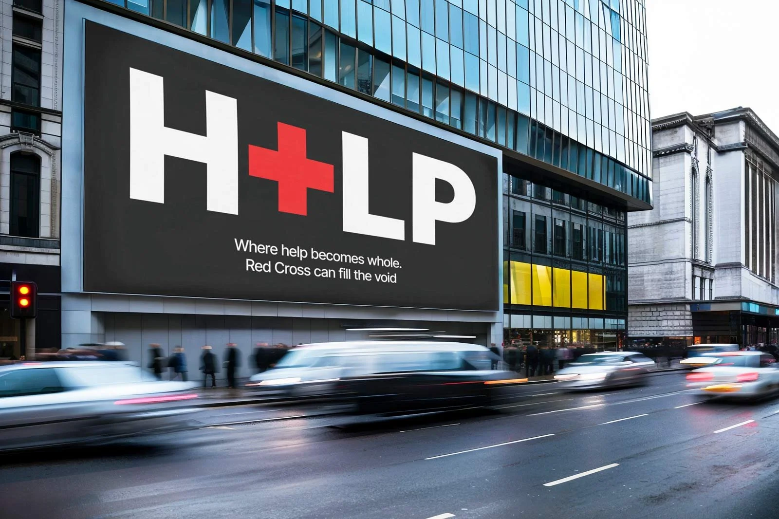
Red Cross H+LP Campaign
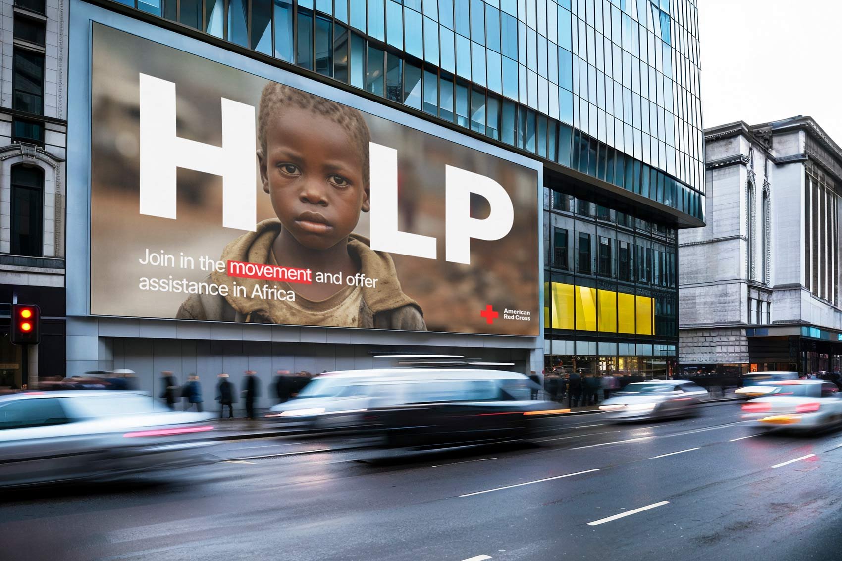
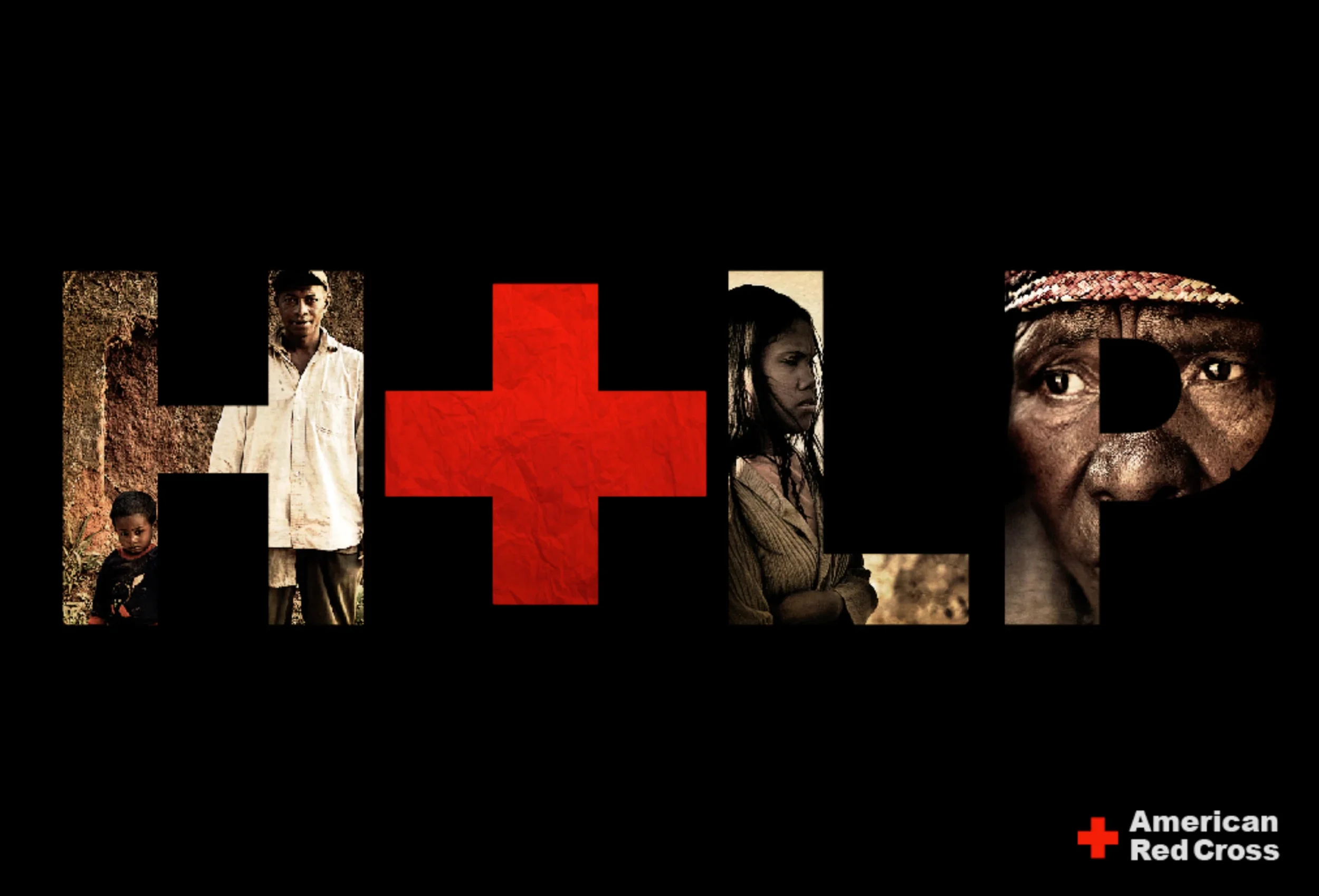
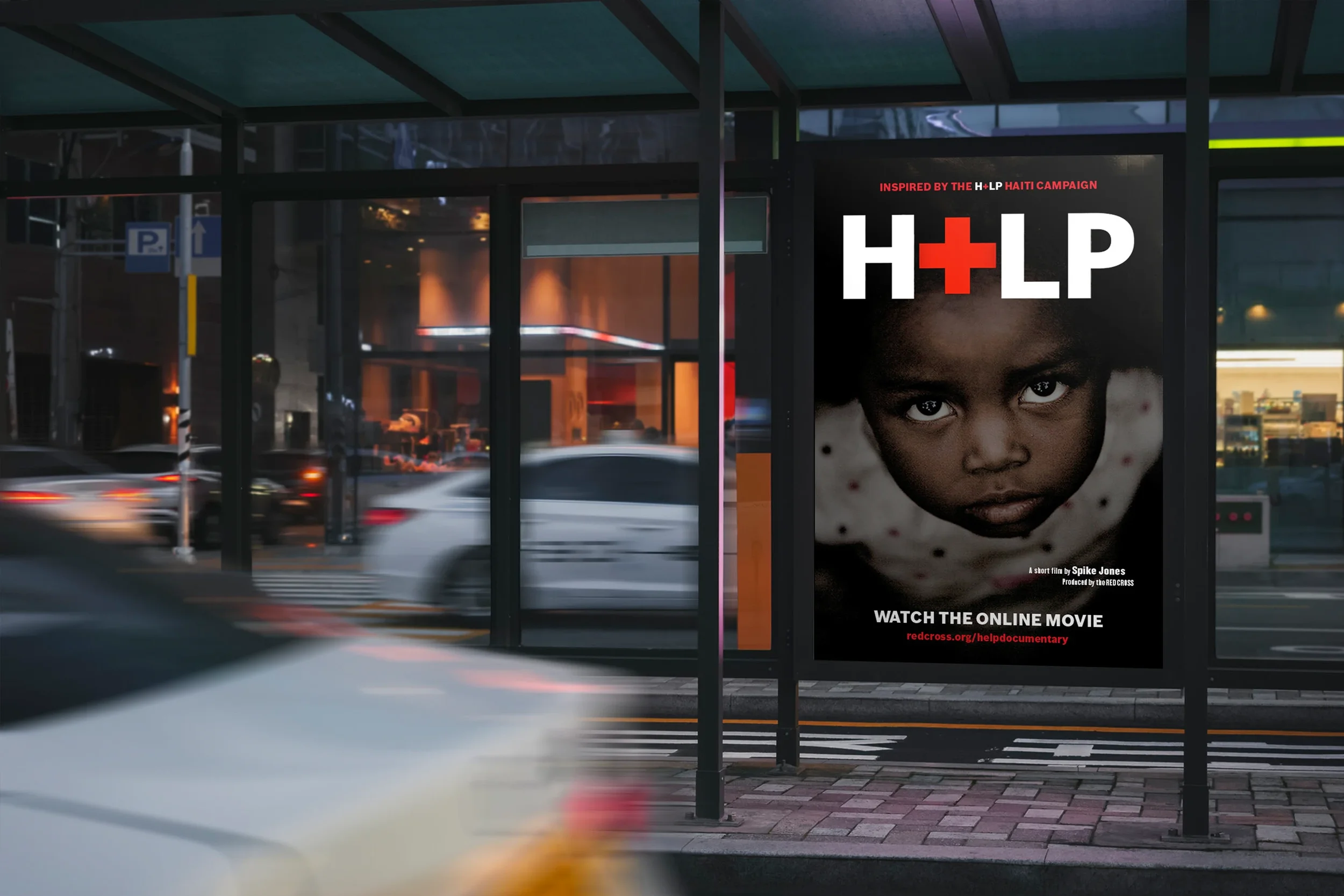
H+LP reframes the word HELP by removing what’s missing—and showing who is affected.
The absent “E” becomes a visual gap filled by children from underserved communities in Africa, representing urgent, unmet needs. The Red Cross symbol steps in to complete the word, reinforcing its role as the organization that fills the gap with action, aid, and hope.
A simple typographic shift becomes a powerful call to act.
Creative Design Services
Shaping who you are and how the world meets you
Websites built to grow alongside your work
A visual language that stays true across channels
Specialized Production
Illustration that adds story, texture, and meaning
Bringing your brand into the physical world
A visual language that stays true across channels

Messages designed to feel personal, not promotional
Quick Links
Contact number (916) 203-1524